The ARC Centre of Excellence for Climate System Science had its send-off at Old Parliament House last week, with a showcase of seven years of amazing climate research. Our five research programs all had dazzling displays, ranging from 3D-printed cumulonimbus to virtual reality explorations of the Earth.
Building the heartbeat
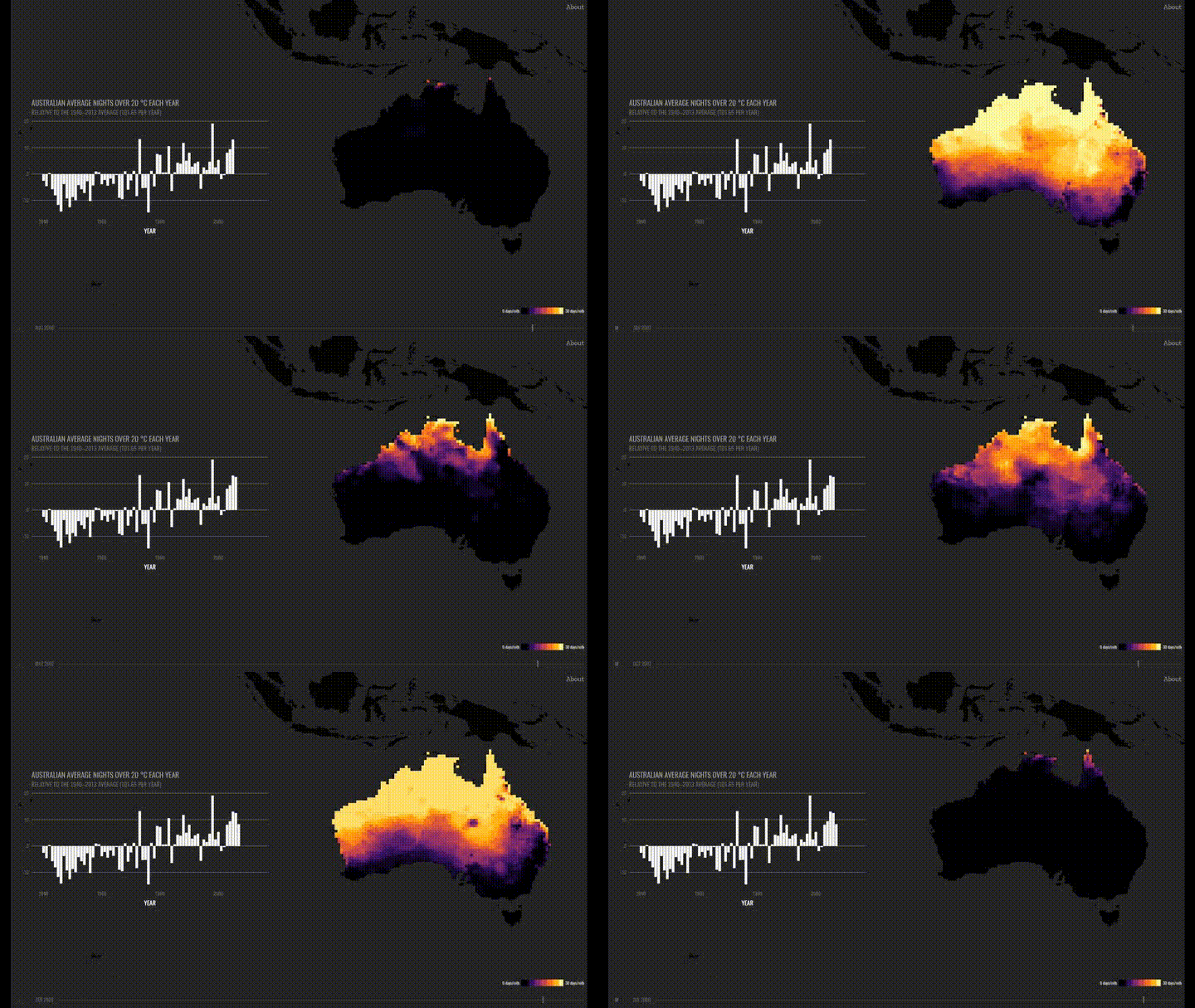
I was invited to build some interactive pieces for the extremes research program. The first, built in collaboration with Dr Andrew King, is called The Heartbeat of Australian Extremes. It shows the trend in hot nights (those that don’t fall below 20 °C) across Australia over the last 70 years.
It’s often said that extremes are a regular feature of the Australian climate. This is true, but many of those extremes are also getting worse—in fact, hot nights across Australia have increased by about 10% since 1940.
It’s a challenge to show both of these truths at the same time. Watching the animated map of hot nights each month, you can see the heat washing in and out from the north like a tide, but you have to look pretty closely to see that tide moving in.
We decided to supplement the map with a bar chart of the annual count, averaged across the country. The bar chart is a bit of a staid classic of data visualisation, but we return to classic plots like these because they make it easy to visually pick out trends, even in noisy data like this. In order to emphasise the trend to users without trying to mislead them, we plotted this as a deviation from the average over the 1940-2013 period (which is about 100 hot nights a year).

The Climdex project
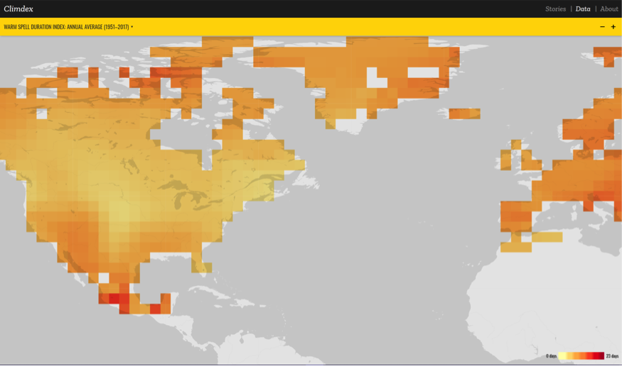
The second visualisation is called Explore Climdex. The Climdex project, initiated by ARCCSS researchers, set out to build dataset of observed and modelled climate extremes. But, with 26 extremes indices to show, there’s a lot to look at. How do we show people the interesting parts?
I decided to build a portal with two modes: one in which an observational dataset could be explored in a fairly typical fashion, with options to select the index, season and type of output, and another in which interesting work and aspects of the data would be displayed in a more curatorial fashion.
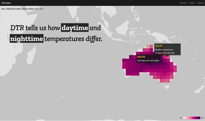
This second mode allows us to pair large scientific datasets with narration and other visual elements in order to tell stories about data. For example, this story draws on earlier research by Karl Braganza, David Karoly and Julie Arblaster, as well as later work by Sophie Lewis and David Karoly, on the way we can use Daily Temperature Range to attribute climate change to the greenhouse effect.

I’m particularly excited by this mode because we can continue to add to it as more researchers make use of Climdex datasets. I’m also hoping to package this functionality up into something that our researchers can use with their new studies: these stories are excellent companion pieces to new papers, whether they’re dropped into student blog posts or embedded in media reporting.
I’m really grateful to the Centre for giving me the opportunity to build these pieces for the showcase. I’ve also written up a more technical blog post on some of the challenges of bringing these things together, so if you’re interested in getting under the hood, please feel free to check that out too!

