Written by Kim Reid
Scientific discovery doesn’t typically originate with a ‘Eureka!’ but with a ‘that’s odd’. A peak on a graph or patch on a map that doesn’t look right. Often, it’s just a bug in your code or a contaminant in your experiment, but very occasionally, a weird pattern in your data can turn into a new discovery.
Our discovery began when I was analysing changing precipitation patterns in Southern Hemisphere weather systems (using a common satellite dataset called GPCPv2.3). I was looking at cold fronts and atmospheric rivers in particular. These systems tend to move north and south with the seasons.
I noticed a thin band of high precipitation over the Southern Ocean that circled the planet at about 65°S latitude which wasn’t moving with the seasons. In a new research, published in Geophysical Research Letters, my coauthors and I find this precipitation is unlikely to be real. It’s potentially an error in the data from changes in satellite instruments over the region. This is a big deal for interpreting climate projections because scientists may think their model is getting the precipitation pattern wrong when actually the pattern doesn’t exist.
Precipitation: Rainfall is liquid water that falls from the sky, but the word precipitation includes snow and ice and as well as liquid water which is more appropriate for the Southern Ocean
What do other datasets show?
I looked at seven different datasets to see if they showed the same rainfall pattern over the Southern Ocean. I thought that if all the datasets show a region of high precipitation at 65°S then it may indeed be real, but if they don’t, that’s a red flag.
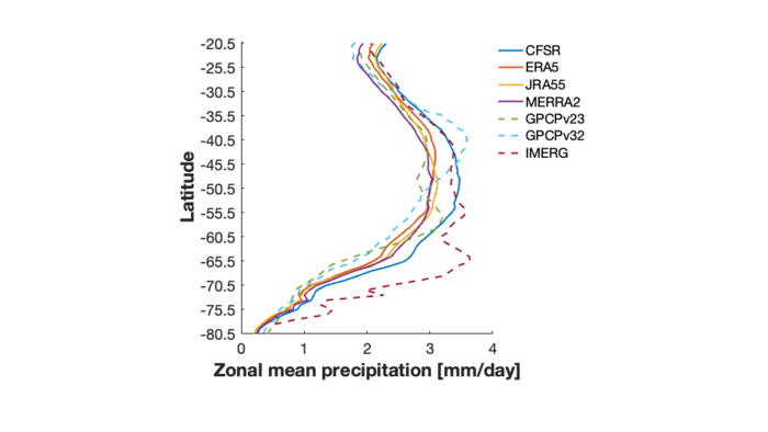
Average precipitation at each latitude for seven different precipitation datasets.
Dashed lines represent satellite observations while solid lines in h represent reanalysis data.
Strikingly, the three satellite datasets (dashed lines) showed three vastly different precipitation patterns over the Southern Hemisphere, evident by the highest precipitation occurring at different latitudes. The reanalysis datasets (solid lines) had more in common with each other but also had some differences.
Reanalysis: Reanalyses combine observations from satellites, weather stations, balloons, ships, buoys, aircrafts and highly advanced weather models to create our best depiction of the atmosphere.
This implies that the satellite datasets are more uncertain than reanalysis datasets and the thin band of precipitation at 65°S could be an error. To test this I needed to compare the satellite and reanalysis precipitation with some other measure of precipitation.
Why is the Southern Ocean important?
So, who cares if it rains over the middle of the Southern Ocean since there’s nothing there. We all should – because it’s important that precipitation patterns are accurate as they can have a significant impact on other parts of the climate system.
The Southern Ocean is the engine room of the climate. About 40% of human-caused CO2 emissions and 75% of global heat is absorbed by the Southern Ocean. Precipitation influences the ocean circulations that absorb the heat and carbon. Southern Ocean processes also influence Australia’s climate. For example, increased precipitation in the Southern Ocean may explain why parts of Australia have experienced a decrease in precipitation as storms move south.

Looking for truth in a data desert
Since the Southern Ocean is so remote and inhospitable, there are very few land or ship based precipitation observations. Rain gauges can’t float on water and have to be kept on the few islands that exist in the Southern Ocean. Scientists rely heavily on satellites to observe the Southern Ocean, however satellites have trouble viewing latitudes higher than about 50°N/S. The data desert of the Southern Ocean is one of the major challenges for climate scientists.
This data desert means we don’t have a “truth” dataset to compare the other datasets to, so we had to be creative. We attempted to work out which dataset was likely closer to the truth by using our understanding of the dynamics of the atmosphere.
The Southern Annular Mode (SAM) is a major influence on Southern Ocean year-to-year precipitation changes – like the El Niño of the Southern Ocean. We would expect precipitation trends to be consistent with the changes in the SAM. The SAM has been changing over the past few decades, particularly in summer, due to greenhouse gas emissions and the ozone hole.
If the precipitation is wildly different to the trend we expect due to the SAM at some locations, it may suggest there are issues with the precipitation dataset. We used statistics to test this.
The results are shown on the plot below:
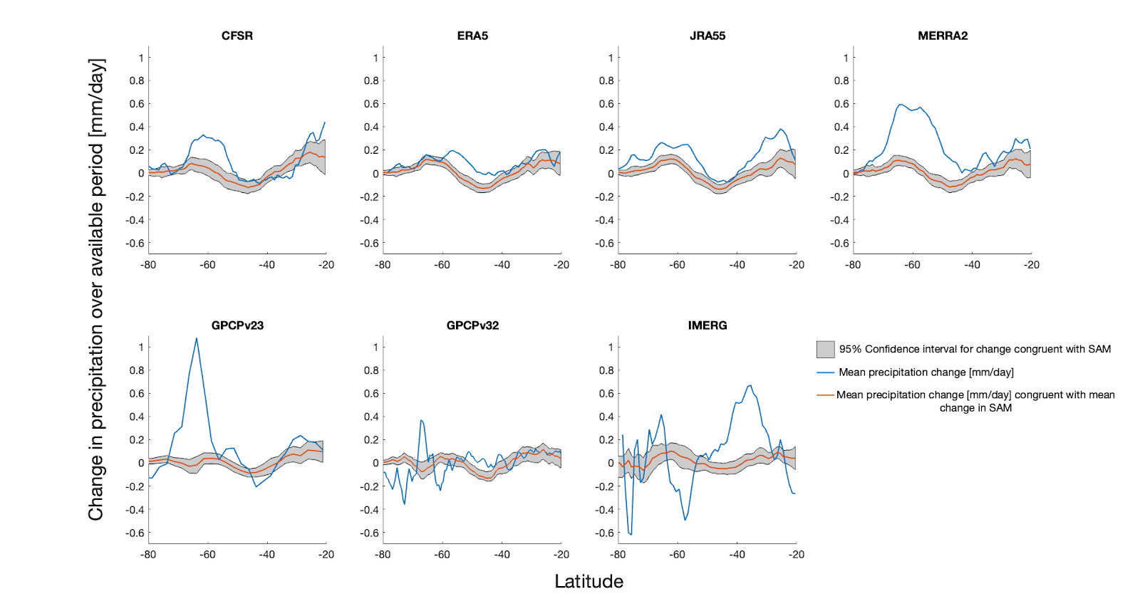
Summer precipitation trend. Red line and shading is the trend that would be expected from the change in the SAM. Blue line is the actual trend. The x-axis is latitude and the y-axis shows the precipitation trend. Top row are reanalysis datasets and bottom row are satellite datasets.
If the precipitation trend was changing with the SAM, we would expect the blue line to roughly follow the grey shading, but there is a big difference in some places.
There is a large blue peak in the GPCPv2.3 dataset at about 65°S. This was where the unusual band of precipitation was in my initial analysis that led to this research in the first place.
Zooming in on the unusual trends
I took a closer look at 65°S where the weird trends were happening.
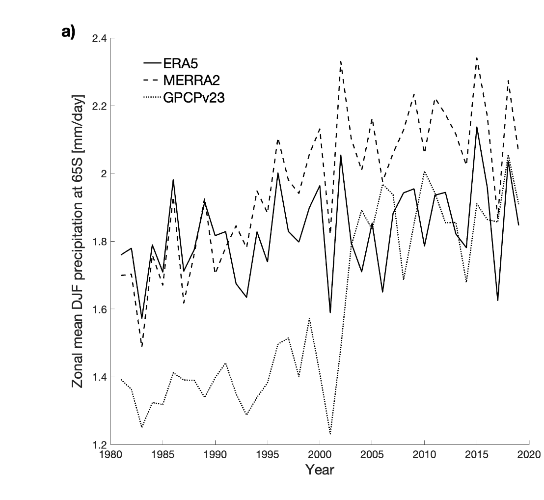
The plot shows the average annual summer precipitation at 65°S for three different precipitation datasets all showing three different trends:
- ERA5 has no trend,
- MERRA2 has an evenly increasing trend and
- GPCPv2.3 has a massive jump (5-standard deviation step change) around the year 2000.
In addition, the relationship (correlation) between the SAM and GPCPv2.3 precipitation reverses after 2000.
The unusual jump coincides with a series of satellite instrument changes that occurred around this time, which we detail in our paper. This is why we suspect the precipitation trend might be fake.
Since reanalysis data uses more than just satellites, it appears to be less affected by the sensor changes. Generally, satellite precipitation is thought to be more accurate than reanalysis precipitation, however, our results demonstrate this is not always true.
Can scientists still use this data?
Global modelling centres are currently ramping up their latest climate models in preparation for the next IPCC report. Clouds and precipitation are a major source of uncertainty in climate models, especially over the Southern Ocean. Therefore, we recommend modellers use multiple observation datasets to evaluate their climate models because relying on satellite data alone might make the model look worse than it actually is, as suggested by our study.
Satellite products are still incredibly valuable but users need to take a close look at the data to make sure there isn’t any monkey business that might affect their experiments.