by Kim Reid
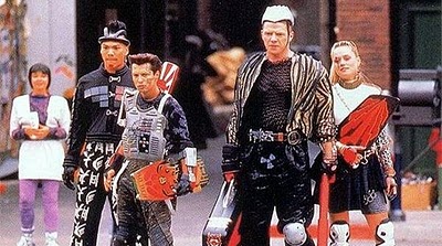
According to Back to the Future: Part II, we were supposed to be riding hoverboards and dressing like this in 2015.

Biff’s Gang, Back to the Future: Part II (1989), ©Universal Studios and U-Drive Productions Inc
While I’m at the dawn of my career, I like to imagine what being a scientist will be like in 30 years, not in regard to what we research, but how we research.
High-quality video calling technologies like Skype and Zoom revolutionised meetings. I can meet with anyone in the world, whenever and wherever, so long as I have an internet connection and computer. Cloud storage means I can write a document on my computer at university and edit it on my phone during my commute home. These advances would have been as futuristic as hover boards to a Phd student from 30 years ago.
I propose a new paradigm shift for how scientists work.
Ugly, convoluted figures that require a paragraph of explanation to understand what the figure is trying to show will become a thing of past.
Journals will allow authors to publish videos, GIFs and interactive plots.
Martin Jucker, from UNSW, creates award winning visualisations of the weather including Virtual Reality (VR) experiences from model output of tropical cyclones and thunderstorms. While VR in journal articles may be a few more years away, interactive 3D figures like Martin’s model of the Polar Vortex during Sudden Stratospheric Warming events can be run on any computer browser.
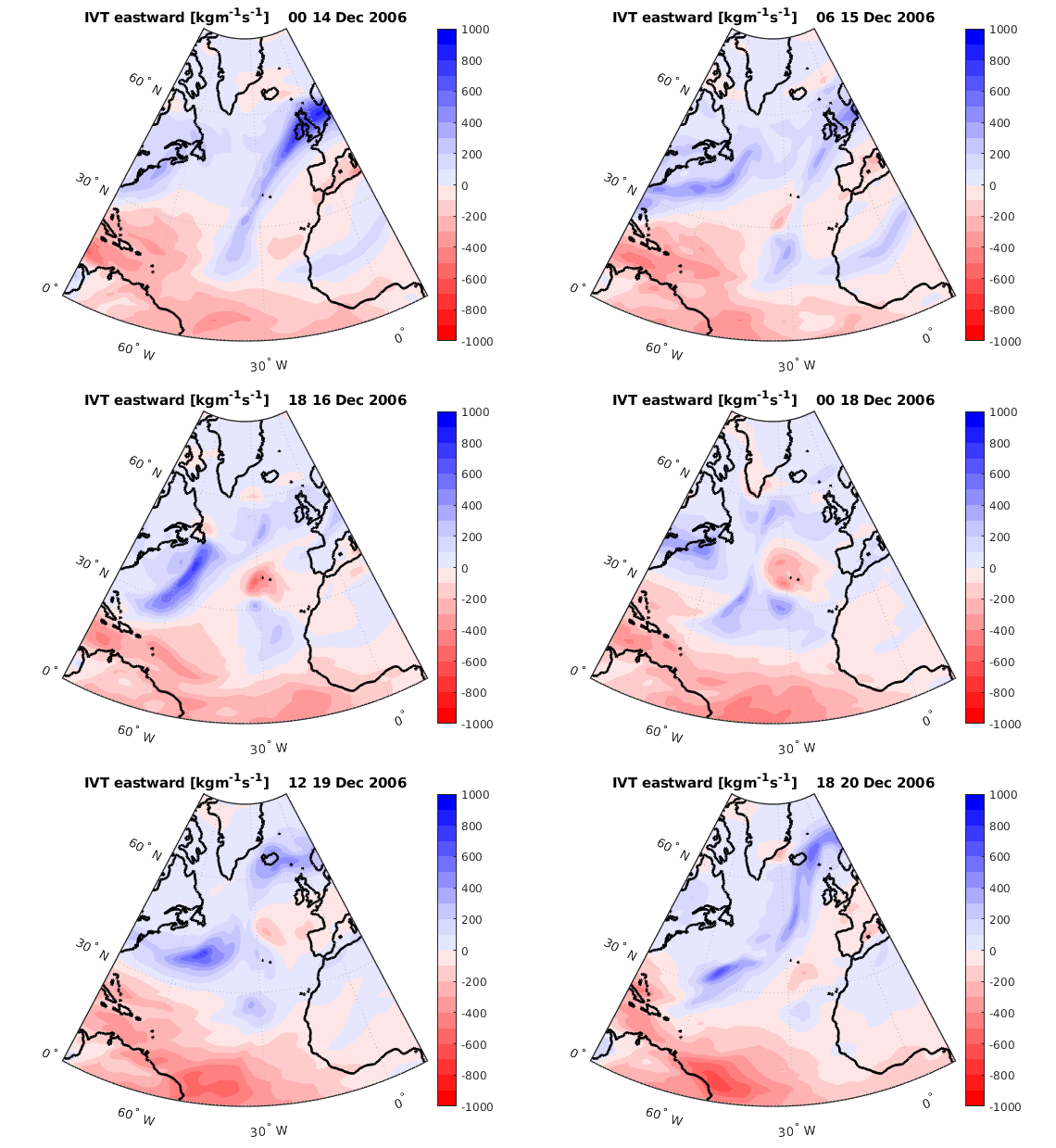
I recently discovered how to make GIFs of my data. It blew my mind how easy the data was to interpret in GIF format. Instead of a 10-panel figure showing the development of a weather event, I can show the same information in a single panel.

You can see the progress of two Atmospheric Rivers over the North Atlantic Ocean during a 6-day period, and a cyclone developing on the 16th of Dec. in a single panel. I used Matlab to produce the individual images then a free online tool to turn them into a looping GIF.

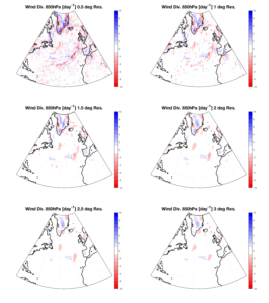
850hPa Wind Divergence during an Atmospheric River at a single time step at 0.5, 1, 1.5, 2, 2.5 and 3 degree resolutions (Data from YotC [Waliser & Moncrieff, 2007])
My supervisors suggested I test how resolution affects whether we can see Atmospheric Rivers. The above GIF shows a snapshot of an Atmospheric River at 6 resolutions. I could’ve shown a 6-panel figure, but as I was doing this analysis for 5 variables, I’d have needed a 30-panel plot to answer the question. I could’ve created an index to measure how well the Atmospheric River was represented then plotted the index at each resolution, but that would’ve required a paragraph of explanation just to understand the figure. This simple GIF is intuitive and answers the motivating question at a glance.
The main caveat for using videos and GIFs in journal articles is they only work for online editions. Given the trends in technology and open access, online only journals with multimedia figures seem like a better future projection than the 2015 fashion in Back to the Future.
- Dee, D. and Coauthors, 2011: The ERA-Interim Reanalysis: Configuration and performance of the data assimilation system, Quart. Journal Roy. Meteor. Soc. 137, 656, 553-597, https://doi.org/10.1002/qj.828.
- Waliser, D. E., and M. Moncrieff, 2007, Year of Tropical Convection – Joint WCRP-THORPEX Activity to Address the Challenge of Tropical Convection. WCRP GEWEX News, Vol. 17, No. 2, page 8.
